BuzzWatch
An AI marketer for small businesses
I lead the product at BuzzWatch, with its two co-founders. BuzzWatch showed a brand what AI tools say about it, then ran the marketing it needed. It was built for marketing teams, while most of its users ran a shop or a B&B. I led the discovery, reframed the offer and designed the new product end to end, from funnel targets to brand. Owners now get one weekly plan, prepared by Dotty, our AI marketer, that they approve in a few minutes.
- Role
- Product Lead & Product Designer, freelance
- Team
- Me + 2 co-founders
- Timeline
- Sept 2026, in implementation
- Scope
- Product Lead, Discovery, UX•UI, Brand, B2B SaaS
01 · Where it started
A product built for someone else
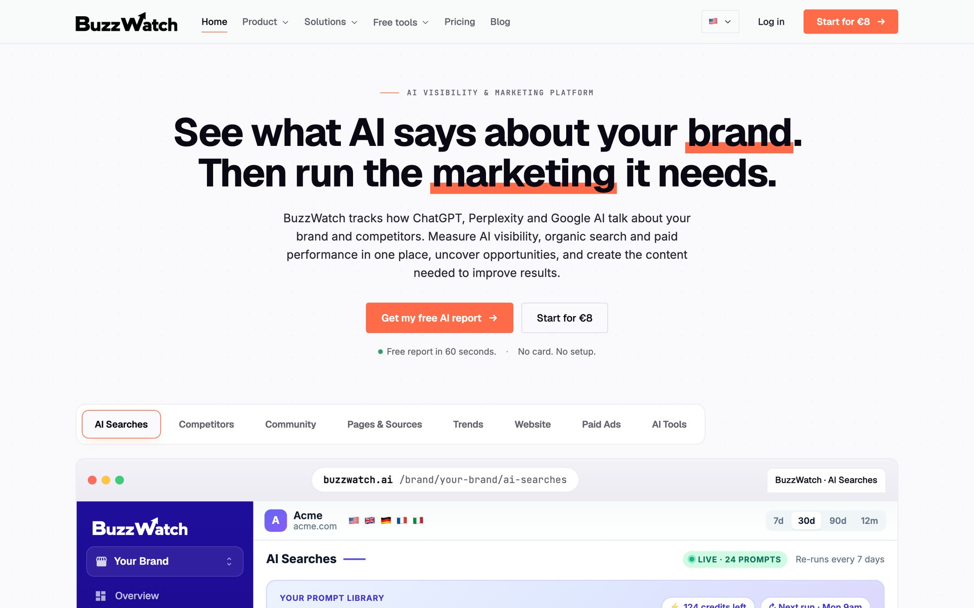
BuzzWatch was vibe coded, without a designer. The screens looked fine, but each new feature landed on the same pages, and the product grew dense and hard to read. That is when a team finds out what a designer is for.
I started with who actually signed up. About 90% ran a business of one to five people, mostly in Spain and Italy: a padel club, a family food shop, a B&B. Many had never heard of GEO. Some had paid an agency €1,000 for a single fix. Even paying users misread their plan: one ran 9 of its 30 or so searches a week, on rotation, and nothing on screen said so.
That set the brief. Keep the engine, and give an owner one clear thing to do next.
02 · The problem
Finding where owners dropped off
I pulled three months of Mixpanel and Stripe data to locate the leak. Checkout was healthy, with about 1 in 4 converting. The drop came earlier, in two places: the free report flow, and the days right after it.
Owners came back to their report expecting the numbers to have moved. The data is weekly, so nothing had changed, and nothing told them what to do in the meantime. A frozen report read as a broken product.
18%
of people who start the free report reach it
24%
of report viewers return the next day, and none of them pay
7%
of free accounts become paying customers, the redesign's main metric
Mixpanel and Stripe, 21 June to 18 September 2026.
03 · Discovery
Five competitors, tested as an owner
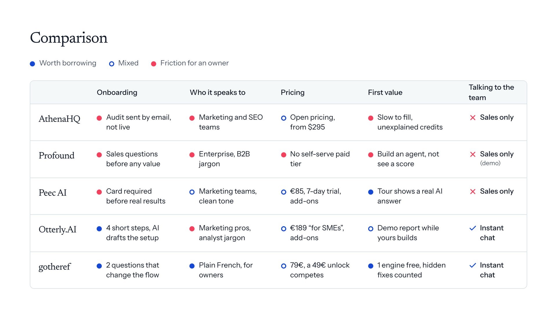
I signed up to AthenaHQ, Profound, Peec AI, Otterly and gotheref as a shop owner would and went through each paywall. Every point of friction went into one grid, sorted into what to adopt, what to avoid and where we could stand apart.
The same traps kept coming up: sales questions before any value, quotas nobody explained, every possible action listed at once. gotheref, which wasn't on our list, did the best job: plain French, and a free dashboard where each locked item says what it is and what opens it. We borrowed that pattern. At 79€ a month plus a 49€ unlock, it also left room on price.
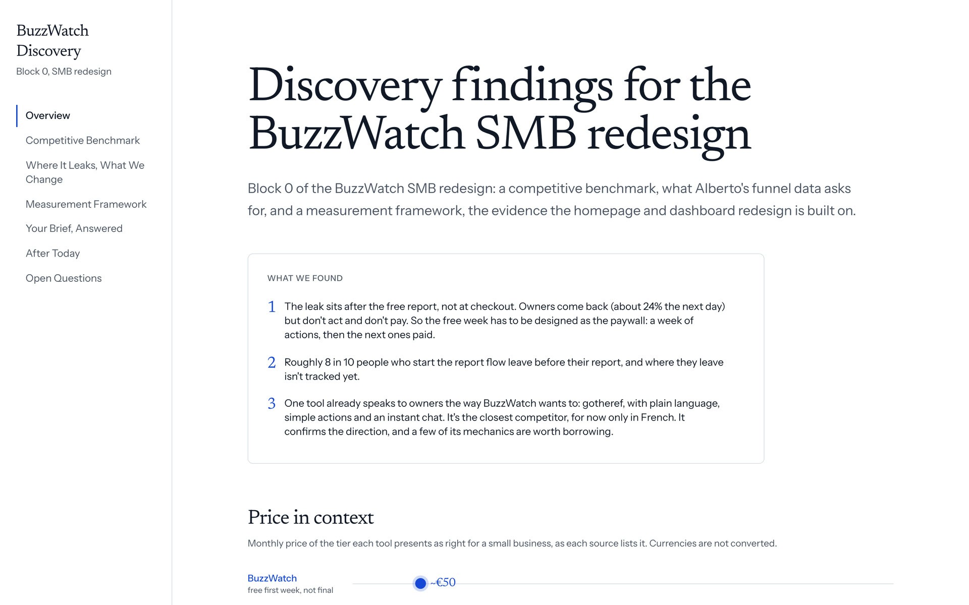
Before drawing a screen, I wrote the measurement framework. Each part of the redesign has one main metric, one early signal and one guardrail. Checkout conversion is a guardrail: if it drops, we are pushing owners to pay too early.
04 · The reframe
Changing what we sell
The founders validated the flows in the wireframe review. Their pushback was on positioning: Guido, the co-founder who sells, came back to the homepage three times. The discovery backed him. Owners compared us with the agency they used to pay €300 to €400 a month, never with another tool.
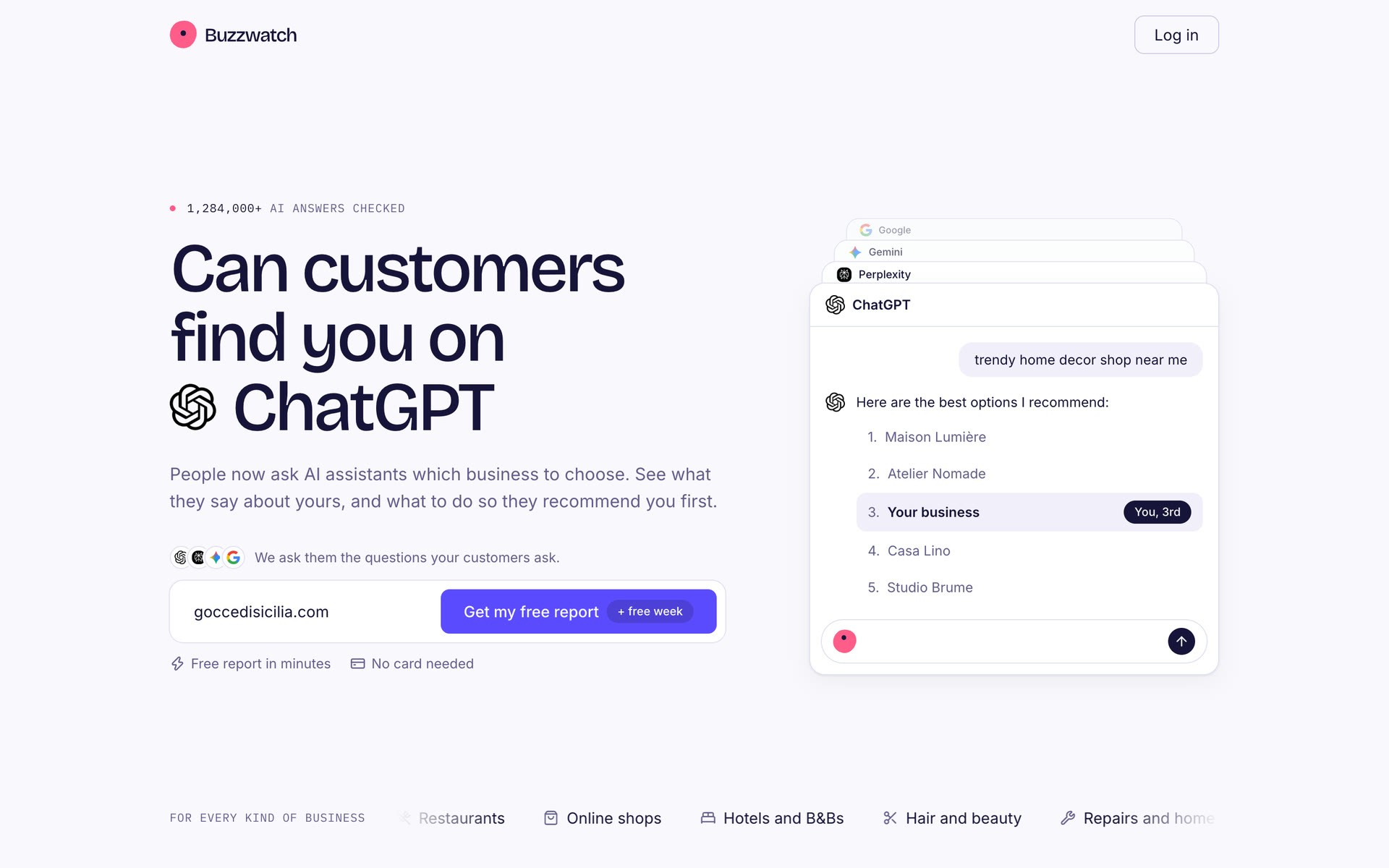
So we repositioned BuzzWatch as an automated marketing agency at €49 a month, on the same engine. The free AI report became the entry point for the Facebook ads, on its own landing page, and the homepage sells the agency.
05 · Wireframes
Wireframes the CTO could build from
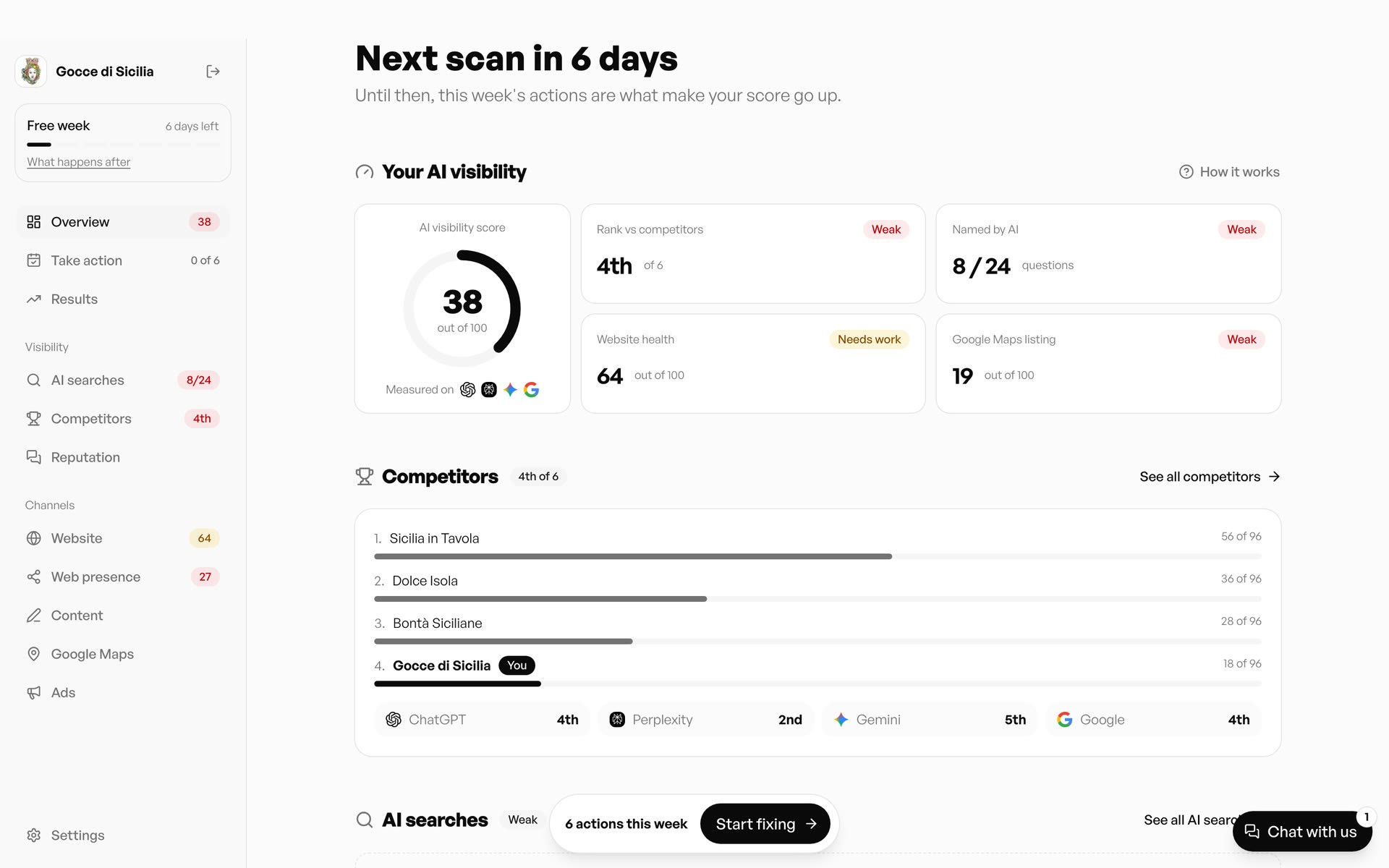
Rather than spend hours drawing wireframes in Figma, I used AI to build them in HTML and CSS, much faster. They carried real copy and real states for an example brand, a Sicilian food shop. Each screen carried its funnel step, its target metric and its open questions, so the founders reviewed flows and numbers.
Every review ended in a dated decision log. Alongside it, one page states the job of each screen and a voice guide fixes the words: tasks, buyer questions, approve. The founders, the CTO and the coding agents all work from that source, and the wireframe repo grows into the production UI.
06 · Simplification
Value before the login
The old flow asked for a sign-in before showing anything. Now we read the website in about 20 seconds and prefill the setup: what they sell, where, what buyers ask, who they compete with. Research on form drop-off pointed at effort per field more than the number of steps, so each correction is one tap on a tag. While the report builds, the screen shows what Dotty, our AI marketer, is reading.
Moving the paywall to day 7
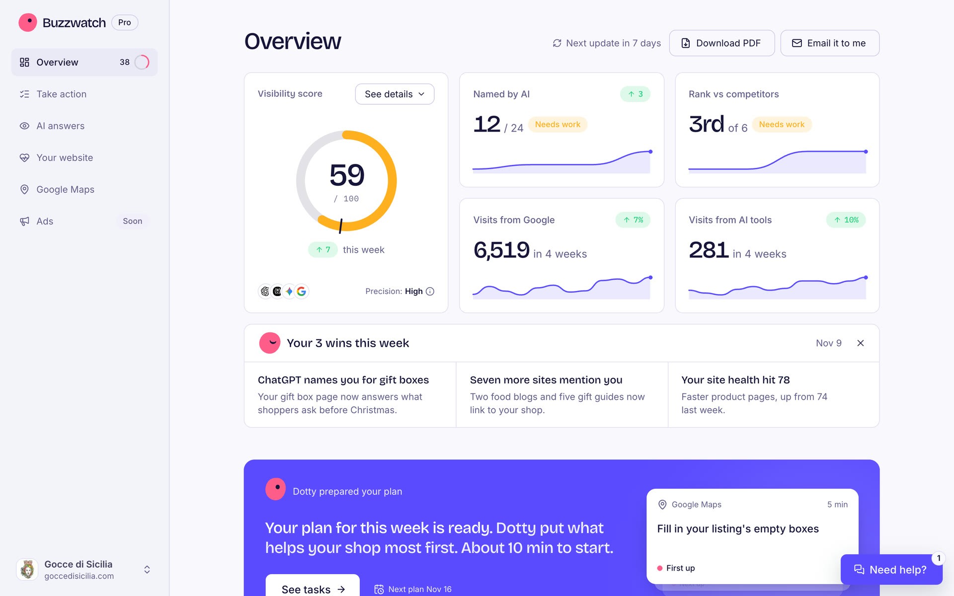
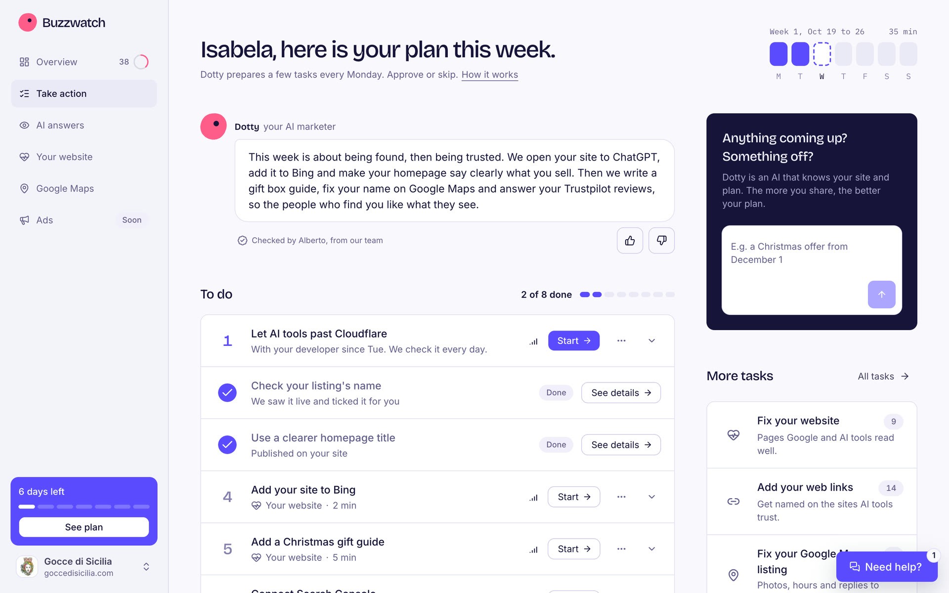
The returning owner was the easiest one to win, so I designed the first week around them. The report becomes the Overview, the page they open every week: one score in five parts, and what moved since Monday.
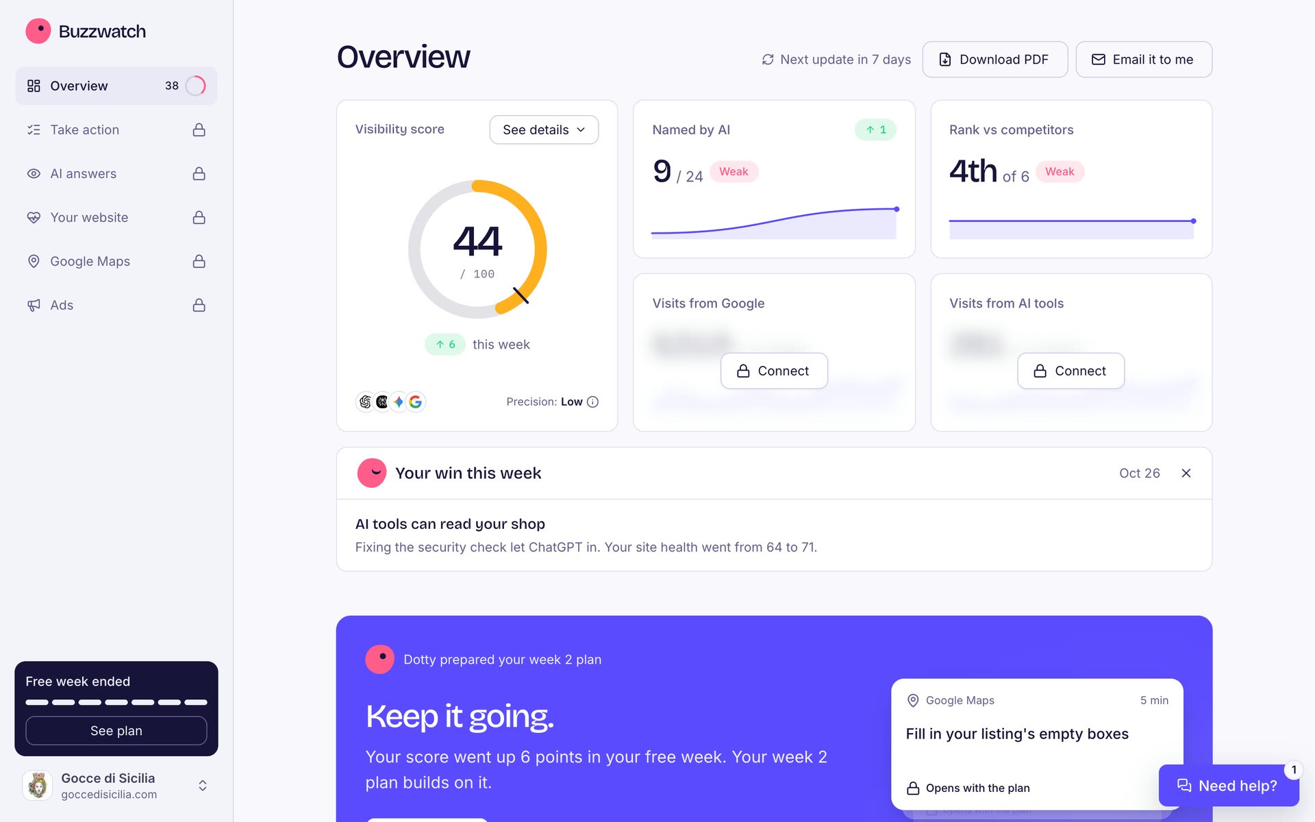
The free week holds a first plan, and a second check runs on day 7. That is where owners decide. The new numbers stay readable, and the work prepared from them is blurred, with its first piece left sharp so the owner reads something real.
One plan a week, ready to approve
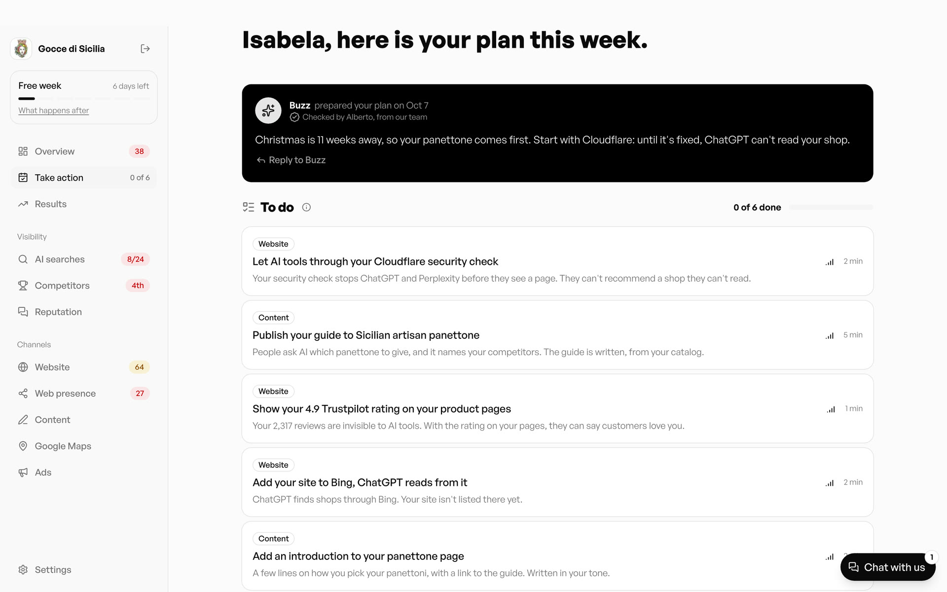
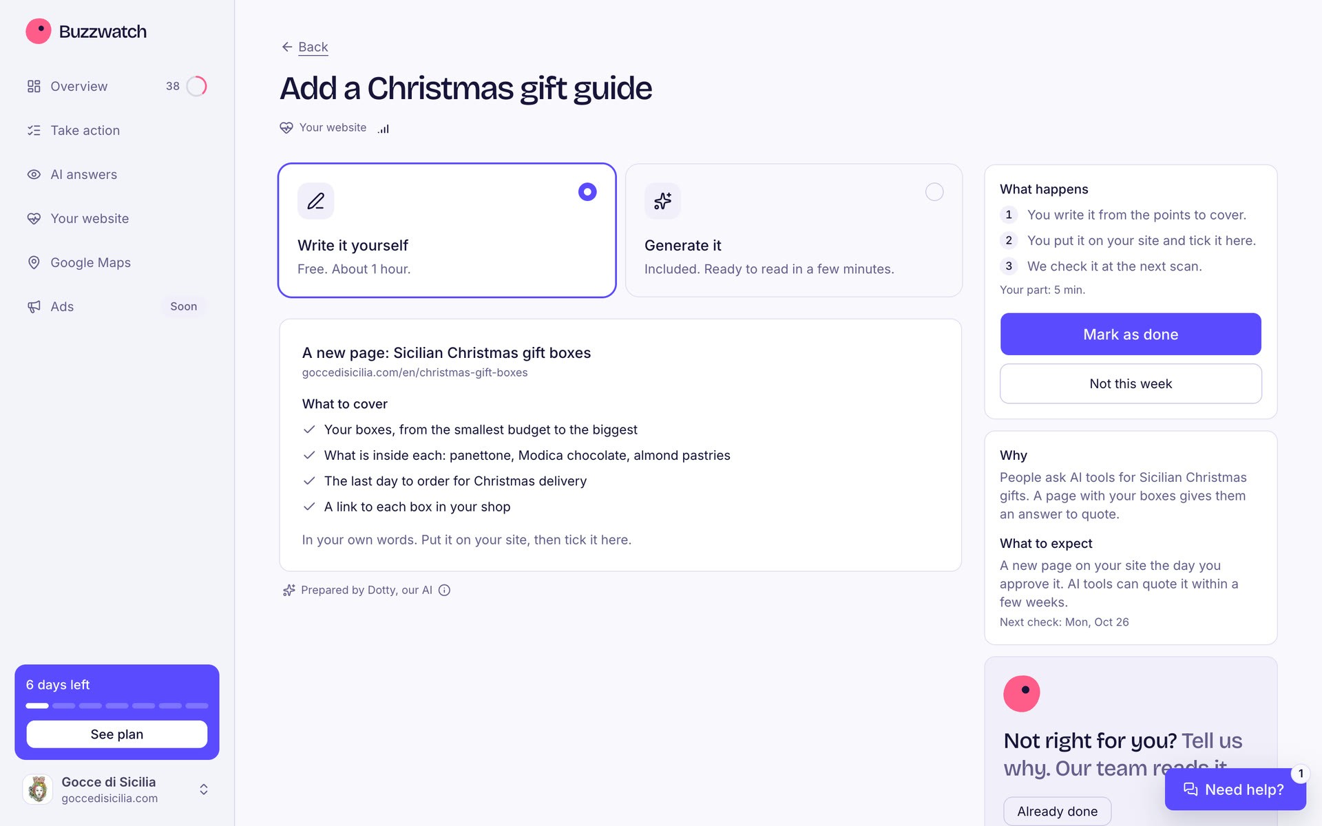
Two competing to-do lists became one plan. Every Monday, Dotty prepares a short list, most impact first, each task with the time it takes. Activation means one task done in the first week, so the first plan only holds tasks an owner can finish right away.
Prepared tasks arrive written and go live when the owner approves. Guided ones happen on Cloudflare, Bing or Google Maps, with every text ready to paste. Owners can skip a task, rate the plan or flag what's coming up, like Christmas, and the next plan builds on it.
Eight spaces, folded into the loop
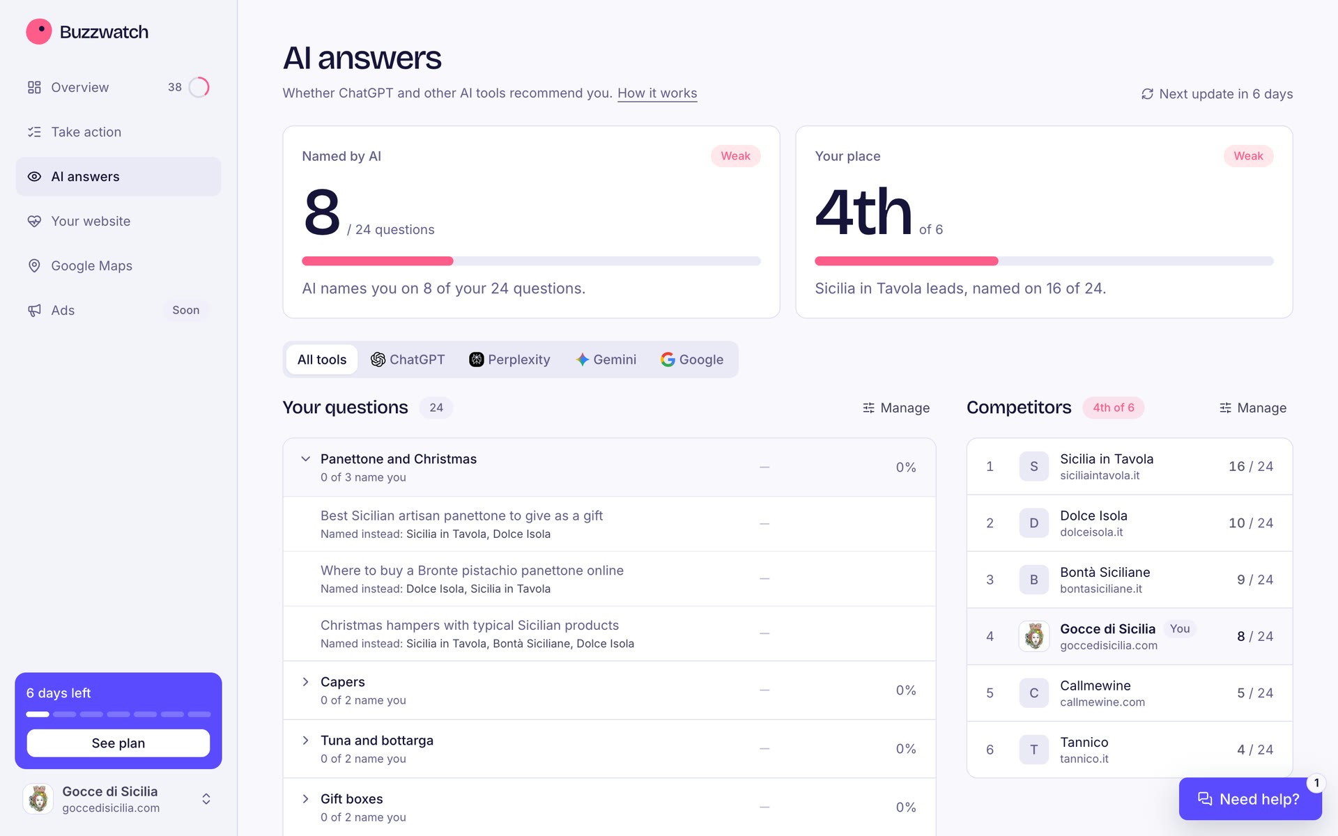
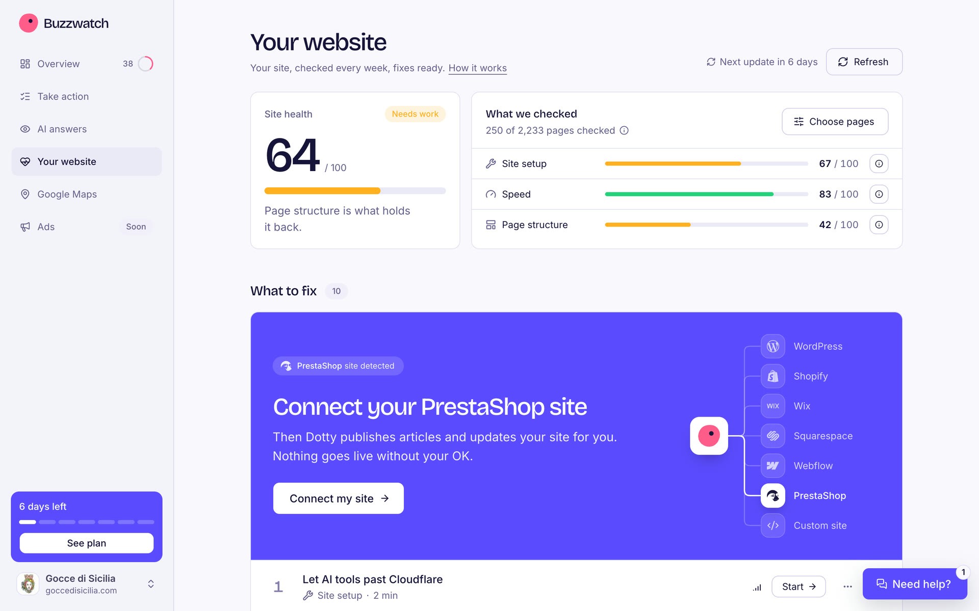
I kept every capability of the engine. AI answers, the website and Google Maps each open on their answer, then list fixes already prepared. Analytics and Search Console moved out of onboarding and into the plan, as tasks framed by what they unlock. Services not live yet show as Soon, so owners see the whole agency in the first week.
07 · Brand
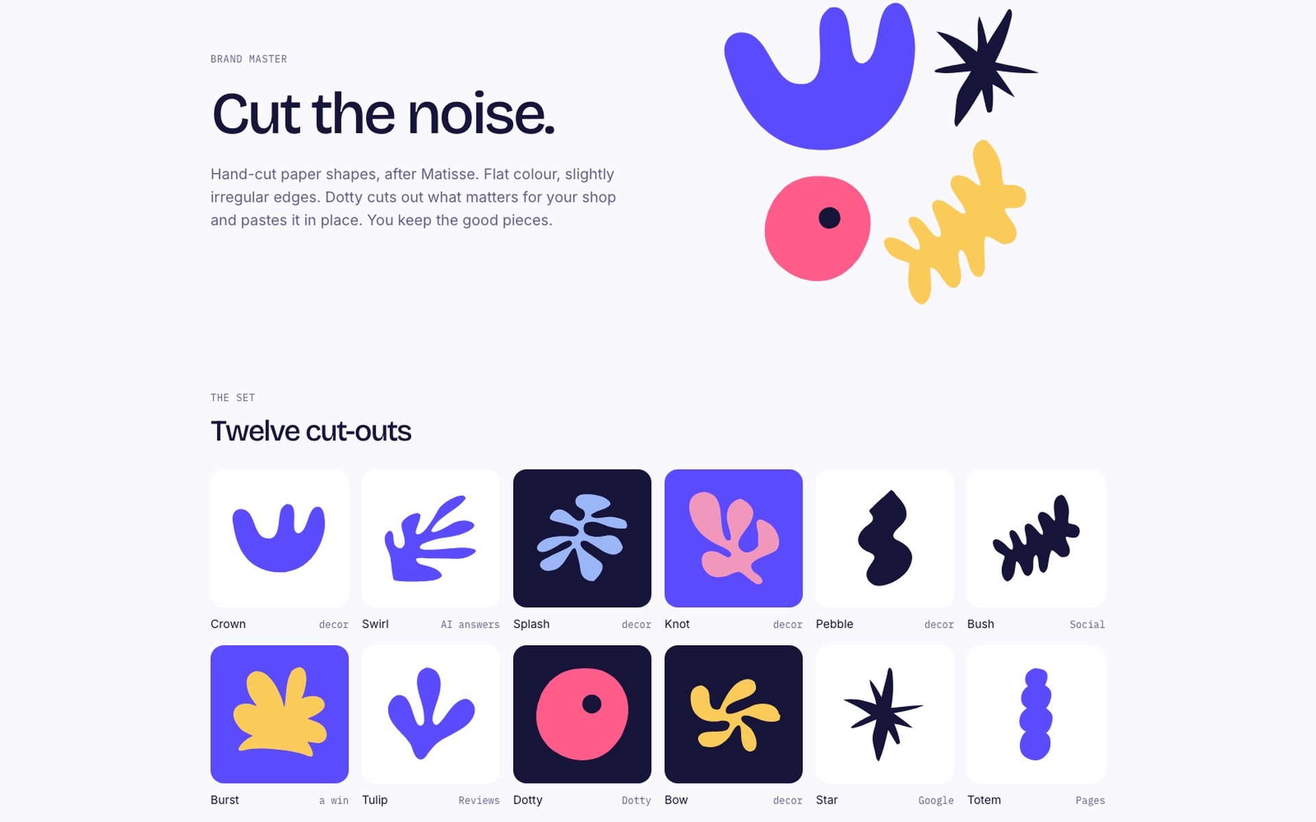
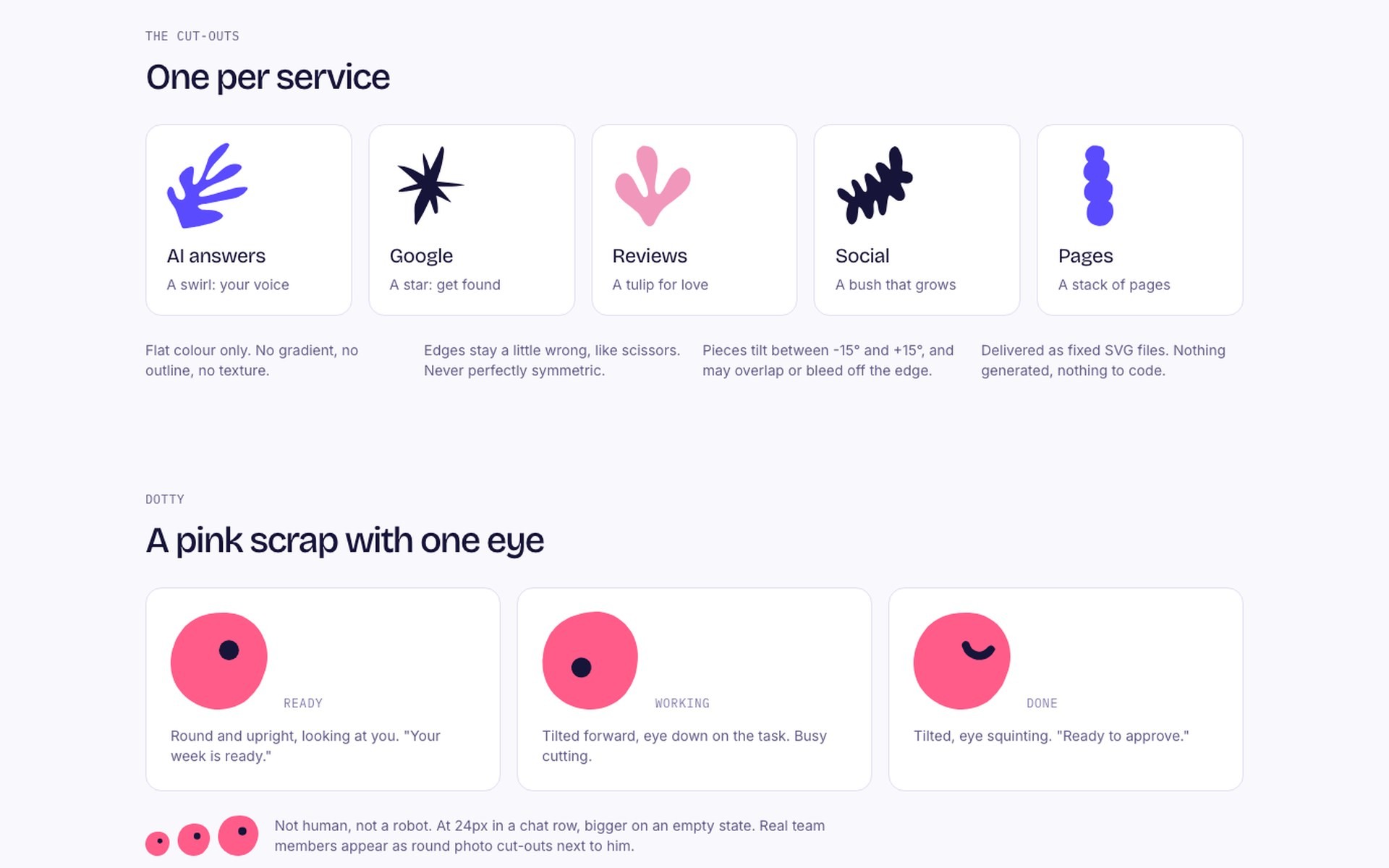
A paper studio, after Matisse
The brief had one test: in five seconds, an owner should feel that we will do the work and can be trusted. That ruled out the usual AI look of purple gradients, sparkles and robots.
I went with hand-cut paper. Flat colour, edges a little off like scissors, one shape per service: a swirl for AI answers, a star for Google, a tulip for reviews. The interface stays quiet around them, with one violet for every action, and the copy is written to be read aloud. “ChatGPT recommends 3 wine shops in Palermo. You're not one of them yet.”
08 · Impact
What we will judge it on
The redesign ships in stages, each with its target. The main one is free account to paid plan, from about 7% today. The early signals are returning owners who reach checkout, and owners who finish a task in their first week.
The redesign is being implemented now, and tests with owners start at the end of November 2026. Results will be added here.
This is the first step. Next, the product becomes AI native: an agent that runs the owner's marketing end to end, with the owner approving rather than doing.